Pages

Tuesday, 15 May 2012

Beautiful website analysis - Tamron

Tamron

The purpose of this website is selling camera lenses. It is a unique and interesting design for selling lenses through a website because it is interactive and lets users experience the usage of the lenses by creating a interactive game in which you have to use the camera in the game to shoot the same photos as accurately as possible to match the photo they show. The more accurate the photo the more points the user scores. By using this method of interactive game to sell the camera lens, users will know the good features of the lens by playing and interacting with the game and will know how it is like to use it. This is a creative way for promoting the good features of the product.

The game takes users to different part of the island for a photo shooting session. The user can navigate around and let the avatar walk around in the game to capture the images that is required to score points. There is a time limit for shooting each of the photos.

The game goes like this:


There are a few places of the island that you can choose from to take photos. Each place shows different situations which photographers commonly take pictures of, such as the sandy beach which shows the usage of lens capturing landscape photos, the jungle for capturing wild life animals photos and so on. This shows that the lens is versatile and is suitable  for many different photo shooting places.

This is how to game looks like:


 The top right corner the the image that users are required to take around that area to score points.
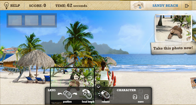


There are clear instruction on how to play the game using the mouse.Users can navigate the avatar to walk left or right using the keyboard keys.


Users can read more information on the lens by clicking the lens of the camera in the game and it will show users a neat table of the features of the lens.


Users can also play around with the zooming feature of the lens and know the details of the zooming feature of the lens.

Overall this website can sell the product effectively and in a creative way by letting users use the lenses in the virtual world and discover the good features of the lens by themselves.

 http://www.tamron-island.se/#


Beautiful website analysis- Spent

Spent


This website is for Urban Ministries of Durham - an agency who provides food, clothing, shelter for homeless people. The purpose of this website to to raise awareness about donation for the homeless people and getting involved in helping them by volunteering in the agency.

The website lets users experience the financial problems faced by these poor people who are in need of help by challenging the user to survive with $ 1000 in a month  in a game as part of the interactivity of this website. This is an effective way of creating awareness by letting people experience the problems faced by homeless people because the people will know the hardship in the life of these homeless people and would create sympathy feeling in the each person who plays this interactive game. The sympathy feeling that the people have after playing this game would make the people decide to help and take action.

This game starts with saying that the agency helps 6000 people and that the users have to prove they don't need the help of the agency by accepting the challenge of this interactive game. It is a effective way of making people accept the challenge and play the game because people would be curious and would like to try out the game and try to prove by winning the game.

Actually in the game, users can never win to show that how hard it is to face the problems. After accepting the game challenge, you have to decide which job that you would like to have in the game in order to survive the one month. Then the game continues by giving users financial problems that are commonly faced by these poor people and lets users make decision about how they would face each financial problem in a day. This lets users know how hard it is to make decisions to survive financially and would urge them to take action.

 In the game, there is a an option of giving up the game for people and if you click on the button, there is a message saying 'This is too hard, isn't it?' and links to go to pages of how to get involved or donate for people who make their mind up to help in the end of the game. Every time when a decision is made, there will be a message saying about the pros and cons of your decision and a fact of how the homeless people face their problems. This is a creative way of laying out the information which can be over whelming

The images below are some of the financial problems that the user has to solve by making tough decisions with the end message of stating the pros and cons of the decisions:


Overall the art direction gives a serious solemn feeling which is the right mood to raise awareness and urge people to take action. This is a good website to raise awareness and has full filled its purpose

http://playspent.org/

Beautiful website analysis- Draw A Stickman

Draw A Stickman

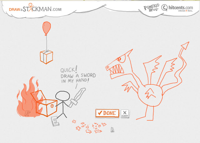
This website is inspiring because it uses simple elements like drawing a stickman in a funny story for users to interact and play. I think that is creative, using simple things or actions we do and turn it into an interactive media to play with and it’s a amazing idea.


First of all, the user has to draw a stickman and a story that involves the stickman will unfold and to continue the story of the stick with help of cues and instructions, the user has to draw other things that the stickman needs to continue the funny hilarious story.

Here are a couple of screen shots of how the story is like:

Chest opens and balloon with box come out from the chest to get the balloon, user has to follow the instruction and draw a balloon in the hand.


Dragon pops out from the egg


Too much rain creates the flood.


Inspiring message comes out.

There are a few episodes on using the same method of interaction. It was fun and entertaining playing this although it uses drawing of a stickman which is a common thing we do.


Beautiful web analysis- AISA Express

AISA Express


AISA Express is a company that does survey of adult population in Czech Republic for clients at regular intervals.

This website is beautiful and unique because it is a research company's main website which is expected to be boring but it turns out to be very interactive and fun.

It starts with a robot saying that he makes light bulbs and with the help of AISA Express research he knows he is doing good business.Then it continues making light bulbs and throwing them into the pile of light bulbs in a cardboard box. A very interesting and unusual introduction because it has a special personal touch of story to it that people can relate to about starting a small business and using the AISA Express service and it is told by a robot which makes it very special and not so common.
The robot can be turn on and off: a fun interactive way of creating animation on the webpage although simple and tiny detail but makes the whole website lively.

As you mouse over the button, the dotted border line will have a little animation.


On the ‘how it works’ page, there is a little animation of a big robot giving out survey then mixing up in house then process it and give back to the big company, small company and tradesman. This shows how the process of research works in the AISA Express. It is in a very lively animation making it easy for people to remember and not boring. Besides the animation, there is also text to explain what it is all about. It is a good way of presenting information by using visuals and animation.

 
On the ‘price calculation’ page, users get to adjust the sliders to see what the price or bill is going to be. It is an interesting way of showing boring information because users get to interact with the website. By interacting with the website, users get to know the information they want. By adjusting the green and yellow sliders, user gets to know what price its going to cost them.


Last but not least, users get to interact with the website by typing random words into the mouth of the robot and the robot will produce a random statement. This shows that the research and survey company does the job as quick as the robot and that they will get the conclusion or statement very quickly and efficiently.

Overall design is bright and fresh. Unexpected for a research survey company. But has interesting little animation to present the info in a creative and clear way visually. They did not use boring visuals such as normal graphs and tables.


http://www.aisaexpress.com